Indian weddings are visual celebrations rich in colour, culture, and emotion. Every event, from the haldi to the reception, creates a distinct mood, and what guests wear becomes part of that shared aesthetic. While silhouettes and fabrics matter, colour coordination often defines whether an outfit feels harmonious or overwhelming.
For wedding guests, choosing the right colours is not about outshining the
Understanding the Role of Colour in Indian Weddings
Colour in Indian weddings is deeply symbolic. Red signifies prosperity, yellow represents purity, green reflects growth, and pastels suggest elegance and modernity. These associations influence how colours are perceived at wedding functions.
As a guest, colour coordination is about respect toward traditions, the
Dressing According to the Wedding Function
Indian weddings are rarely a single event. Each function has its own energy, and colour choices should reflect that.
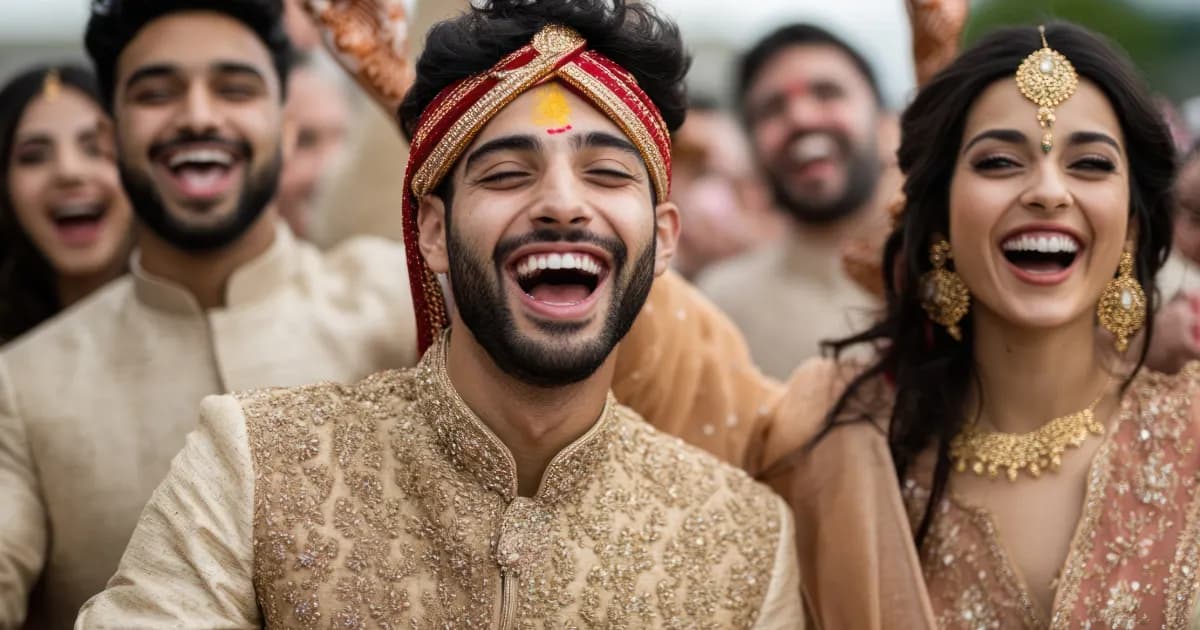
Haldi and Mehendi Celebrations
Daytime functions like haldi and mehendi favour light, cheerful colours. Yellows, greens, soft oranges, and playful pastels work well. These shades photograph beautifully in natural light and complement the informal, joyful vibe.
Avoid dark or heavy colours during these events, as they can feel visually heavy and clash with the relaxed atmosphere.
Sangeet and Cocktail Nights
Evening celebrations allow more experimentation. Jewel tones, metallic accents, and deeper shades like emerald, wine, or navy bring drama without being overpowering.
Colour coordination here is about movement and rhythm. Since these events often involve dancing and music, colours that catch lightpaired with subtle
Wedding Ceremony
The main wedding ceremony calls for elegance and cultural awareness. While red is traditionally reserved for the bride, guests can opt for complementary shades like maroon, rust, gold, or muted pinks.
Avoid overly loud combinations that distract attention. Balanced, rich colours paired with refined details reflect respect for the ceremony’s significance.
Reception Events
Receptions are often more formal and contemporary. Neutral bases ivory, beige, grey paired with bold accents create sophisticated looks. This is where modern colour blocking or monochrome styling works beautifully.
Coordinating Colours Without Matching Exactly
One common misconception is that coordination means matching. In reality, good coordination is about harmony.
Choose colours from the same tonal family rather than identical shades. For example, if the décor leans toward warm golds, opt for complementary earthy tones rather than exact gold hues. This ensures your outfit aligns visually without blending into the background.
Balancing Traditional and Modern Colour Palettes
Indian wedding fashion sits at the intersection of
Traditional colours like red, maroon, and mustard feel timeless when styled in contemporary silhouettes. Modern pastels and neutrals gain depth when paired with traditional fabrics or textures.
The key lies in mixing eras thoughtfully rather than choosing one over the other.
The Importance of Fabric and Colour Interaction
Colour behaves differently depending on fabric. Silk reflects light, making colours appear richer. Chiffon and georgette soften hues, while velvet deepens them.
When selecting an outfit, consider how colour and fabric interact. Heavy embroidery amplifies colour intensity, while minimal detailing allows shades to remain subtle.
Understanding this interaction prevents outfits from appearing too dull or overly dramati
Avoiding Colour Clashes With the Bridal Party
While guests should dress festively, it’s important not to clash with the bridal party’s palette.
If the wedding invitation hints at a colour theme, respect it. Avoid wearing shades that are traditionally reserved for the bride or
This awareness ensures visual cohesion during ceremonies and group photographs.
Day vs Night: Adjusting Colour Intensity
Lighting plays a crucial role in colour perception. Daytime events favour lighter, softer shades that complement sunlight. Nighttime events allow deeper, bolder colours to shine.
Pastels and muted tones may appear washed out under artificial lighting, while dark shades can feel too heavy during the day. Adjusting colour intensity based on timing ensures your outfit always looks intentional.
Using Accessories to Enhance Colour Coordination
Accessories are powerful tools in colour balancing. Instead of introducing too many colours in the main outfit, use jewelry and accent pieces to add contrast.
Gold or silver accessories can neutralise bold colours, while gemstone accents can introduce controlled vibrancy. Accessories should enhance the outfit’s palette rather than compete with it
Coordinating Colours in Group or Family Dressing
When attending weddings as part of a family or group, subtle coordination creates a polished appearance.
Choose a shared colour family pastels, neutrals, or jewel tones while varying shades and silhouettes. This approach looks cohesive in photos without appearing overly styled.
Group coordination should feel natural, not forced.
Cultural Sensitivity in Colour Choices
Different regions in India interpret colours differently. What feels celebratory in one culture may feel inappropriate in another.
Being mindful of regional customs demonstrates respect. For example, white may be avoided in certain contexts, while black might be acceptable at evening receptions in urban settings.
Understanding cultural nuances enhances thoughtful dressing.
When to Experiment and When to Keep It Safe
Not every wedding is the same. Destination weddings, fusion ceremonies, and intimate celebrations allow more experimentation.
However, when in doubt, it’s better to lean toward subtle elegance. Classic colour combinations rarely fail and allow personal style to shine through fit and detailing.
The Role of Personal Style in Wedding Colour Choices
While guidelines are helpful, personal comfort and confidence matter most. A colour that aligns with your skin tone and personality will always look better than one chosen purely for trend.
Weddings are social events, often lasting long hours. Wearing colours that feel natural ensures you stay comfortable and confident throughout the
Creating Visual Balance With Colour Placement
Colour coordination isn’t just about shade selection it’s also about placement.
If an outfit features a bold colour, balance it with neutral elements. For example, a vibrant dupatta over a softer base creates contrast without overwhelming the look.
Visual balance makes outfits appear refined and well thought out.
Sustainable Thinking in Wedding Guest Dressing
With multiple weddings often clustered in one season, colour coordination also supports repeat wear.
Choosing versatile colours allows outfits to be restyled across different events. This approach reduces wardrobe fatigue and encourages conscious consumption.
Thoughtful colour choices extend the life of festive wear.
Why Colour Coordination Elevates Wedding Style
Well-coordinated colours create visual harmony, enhance photographs, and reflect an understanding of occasion and culture.
For wedding guests, colour coordination is not about standing out it’s about belonging beautifully within the celebration. When done right, it elevates not just individual outfits, but the collective aesthetic of the event.
Indian weddings thrive on togetherness, and colour plays a subtle yet powerful role in expressing it.
